
How to make a photography website. A nine step build order covering what the site is for, cutting the portfolio, choosing a platform, building the pages, writing the copy, exporting images and filling in the SEO fields.
Most photographers build their website in the wrong order. They pick a platform first, then a template, then start dropping in images, and the copy gets written last in a hurry the night before launch. That order is why so many photography sites look expensive and convert badly.
The order below is the one I use on client builds. The first two steps happen before you open any website builder at all.
How do you make a photography website?
In nine steps: decide what the site is for, cut your portfolio down, choose a platform, build a small set of pages, write the copy, export the images properly, fill in every SEO field, connect your enquiry form and galleries, then run a launch check.
The four that people skip are steps one, two, five and seven, and those are the four that decide whether the site earns anything.
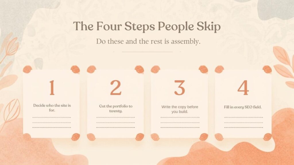
The build order that matters. One, decide what the site is for. Two, cut the portfolio. Three, write the copy. Four, fill in the SEO fields. These are the four steps photographers skip.
Step 1: Decide what the site is for
Write one sentence naming who you want to enquire and what you want them to do. Everything else is downstream of that sentence.
“Wedding photography for couples getting married in Colorado, and I want them to enquire about availability” produces a completely different website from “fine art landscape prints, and I want people to buy.” One needs an enquiry form and venue content. The other needs a shop, shipping and print sizes.
Photographers who skip this end up building both halfheartedly. If you genuinely do two things, pick the one that pays your rent and build for that. The other can be a single page.
Step 2: Cut your portfolio to about twenty images
Twenty across your whole homepage and portfolio, not twenty per gallery. This is the hardest step and it is the one that most improves the result.
A hundred images does not read as a bigger body of work. It reads as an inability to choose, which is the opposite of what a client is hiring you for. A tight edit of twenty frames that all look like they came from the same photographer is more convincing than a hundred that show you can shoot anything.
Two practical rules:
- Cut anything that is only in there because it was hard to get. The client does not know it was hard.
- Cut anything that does not look like the work you want more of. Your portfolio is a job advert. Whatever is in it is what you will be asked to shoot.
If you cannot get below twenty, ask a photographer you respect to pick their favourite fifteen and use those.
Step 3: Choose a platform
For most working photographers this is Showit or Squarespace, and the deciding question is whether the way your site looks is part of how you sell.
Showit works like a design tool. You drag elements anywhere on an open canvas, overlap them, layer type across an image, and you get a separate mobile layout you control for every page. Photographers choose it because template sites in this industry all start to look alike, and looking like everyone else is a real commercial problem when your product is your eye. Its blog runs on WordPress underneath on the paid blog tiers, which means proper SEO tooling. The honest cost is that the separate mobile canvas is twice the layout work on every page you ever add.
Squarespace is the right answer if you would rather never think about the website again. It maintains itself, the templates are strong, and every field search engines read is editable. You are accepting a template’s structure and a narrow set of technical limits in exchange.
WordPress is worth it if you are selling prints properly, running a course, or publishing at real volume. Otherwise it is a maintenance job with your name on it.
Do not choose based on which sounds most professional. Choose based on who is going to maintain this in eight months.
Step 4: Build these pages
Four core pages, plus two optional ones. Resist the urge to add more.
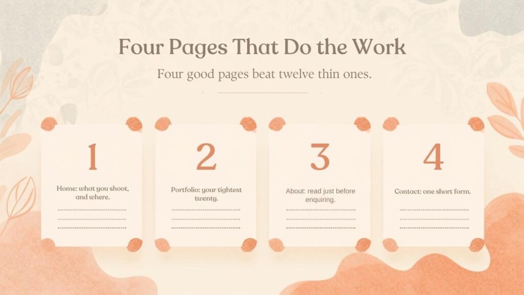
Four pages that do the work. Home, to answer who you are and what you shoot. Portfolio, your tightest twenty images. About, the page clients read most before enquiring. Contact, one short form and a clear next step.
Home. Who you are, what you shoot, where you are based, and one route to enquire. Your strongest image at the top and your city in the first sentence.
Portfolio. Your twenty images. Split into two or three galleries only if the categories are genuinely different, like weddings and portraits. One well-edited gallery beats five thin ones.
About. This gets read more than photographers expect, usually right before someone enquires. It is not your CV. It is the page where a stranger decides whether they want to spend eight hours with you.
Contact. One short form. Name, email, date, location, a message box. That is enough.
The two optional pages are Investment or Pricing, and a blog. Put at least a starting price on the pricing page if you have one, because leaving it off does not read as expensive-but-worth-it, it reads as expensive-and-evasive, and people move on. The blog matters if you intend to be found in search, which is step seven.
Step 5: Write the copy
Write it before you build, in a plain document, and write it about the client rather than about yourself.
This is the step photographers most reliably do badly, and the failure is always the same: opening with a mood instead of a message. “Capturing moments that last forever” tells a visitor nothing. It could be on any photography site in the world.
Compare:
Weak: “Timeless imagery for the modern romantic.”
Strong: “Wedding photography in Denver and across Colorado, for couples who want the day to feel like their own rather than a shot list.”
The second one answers what you shoot, where you work, and what you are like to hire, before anyone scrolls.
A shortcut that works: write down the three questions you get asked most in first enquiries, then make sure the homepage answers all three above the fold.
Step 6: Export your images properly
This is where photography websites get slow, and it has nothing to do with the platform.
Export at a 2000 pixel long edge for standard use and 2500 for a full-width hero, as JPEG at quality 70 to 80, converted to sRGB. Aim to keep each file under about 300 KB. A little sharpening after resizing makes up for what the downscale costs you.
Two things that matter as much as the settings:
- Convert to sRGB. Files left in Adobe RGB or ProPhoto render dull and slightly wrong in browsers, which is a mystifying problem to debug and a one-click fix.
- Name the files before you upload. denver-botanic-gardens-wedding-01.jpg is worth having. _DSC4471.jpg is a wasted signal, and you will never rename it later.
Photographers routinely upload 4000 pixel, 2 MB files straight out of Lightroom, which is how a homepage reaches 15 MB. No platform choice rescues a 15 MB homepage.
Step 7: Fill in the SEO fields and write real alt text
This is the least interesting hour of the whole build and reliably the highest value.
On every page, set the page title and meta description yourself rather than letting the platform generate them, and put your city in both on the pages where it makes sense. Make the URL slug readable. Use one H1 per page and real headings below it, not styled text boxes that only look like headings.
Then write alt text, properly.
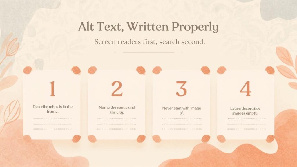
Alt text written properly. Describe the photograph. Name the venue and the city when you know them. Skip the words image of. Leave purely decorative images empty.
Alt text exists first for people using screen readers and second for search engines, and writing it well serves both. Four rules:
- Describe what is actually in the frame. “Bride and her father laughing in the doorway before the ceremony” is useful. “Wedding photo” is not.
- Name the venue and city when you know them. “Ceremony under the oak at Denver Botanic Gardens” earns you a genuine local signal and helps a real person picture the image.
- Do not start with “image of” or “photo of.” A screen reader already announces that it is an image.
- Leave purely decorative images empty. A texture or a divider should have empty alt text so it is skipped rather than narrated.
Do not stuff keywords here. Alt text that reads like a search query is both worse for accessibility and a pattern search engines discount.
Step 8: Connect your enquiry form and your galleries
Keep the enquiry form short, and keep client galleries off your website entirely.
Test the form yourself, from a phone, and check the email actually arrives and does not land in spam. Then write what happens next directly on the page: “I reply to all enquiries within two working days” removes more hesitation than any reassuring adjective.
For delivery, use Pic-Time, Pixieset or similar and link out to it. Delivery galleries need downloads, print ordering, expiry, passwords and album proofing, and no website builder does those well. Hosting them yourself gets you enormous page weight and a worse client experience than the apps your clients have already used with other photographers. Your website wins the booking; the gallery platform delivers the work.
Step 9: Run a launch check
Six things, in this order, before you tell anyone the site is live:
1. Open every page on a phone. More than half your visitors will.
2. Click every link and submit the form. Broken contact forms are the most expensive bug on a photography site and the most common.
3. Check your page titles in a search result preview. Not one of them should say “Home.”
4. Test your load time on a slow connection. If the homepage takes more than a few seconds, go back to step six.
5. Submit your sitemap in Google Search Console. Free, five minutes, and the only way to know what is actually indexed.
6. Set up redirects if you are replacing an old site. Every old URL needs a 301 to its new address or you lose the rankings you already earned. This is the single most common way a rebuild goes quietly wrong.
Frequently asked questions
How many photos should be in a photography portfolio?
Around twenty across the whole site for most photographers, and no more than about thirty. If you split into galleries, keep each one tight rather than padding all of them to the same length.
What pages should a photography website have?
Home, Portfolio, About and Contact as the core, with Pricing and a blog as worthwhile additions. Four good pages beat twelve thin ones, and the About page gets read far more than most photographers expect.
How long does it take to build a photography website?
A weekend to a week if you are building it yourself from a template with your copy already written. Two to six weeks for a professional build, and the variable is nearly always how quickly the images and copy arrive, not the design.
How much does a photography website cost?
A self build costs the platform subscription plus a template, so roughly $30 a month plus a one-off $100 to $400. A professional build generally lands between $1,200 and $3,500 depending on page count and whether copy is included.
Do I need a blog?
Only if you want to be found by people who do not already know your name. Posts about specific venues, cities and shoot types are how photographers show up in search. If you will not publish consistently, skip it, because three posts from two years ago signal less care than no blog at all.
Can I build it myself?
Yes, and plenty of excellent photography sites are self built. Both Showit and Squarespace are usable without technical skill. What you are paying a designer for is mostly the edit, the structure and the copy, not the dragging and dropping.
The short version
Decide who the site is for. Cut to twenty images. Write the copy before you build. Four pages, not twelve. Export at 2000 pixels and under 300 KB in sRGB. Fill in every SEO field and write alt text that describes the actual photograph. Keep delivery galleries on a delivery platform. Then check it on a phone before you tell anyone.
The platform matters less than any of that. The order matters more than the platform.
AUTHOR BIO (for the host to publish)
Adil Makhdoom is a website developer in Lahore, Pakistan, working with photographers and small studios across the US, UK and Australia. Most of that work is Showit design and Showit SEO for photographers, and he writes about what actually moves the needle for creative businesses at theadil.me.
